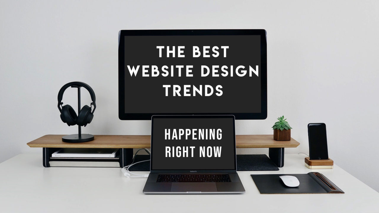
The Best Website Design Trends Happening NOW
If you’re looking to grow your business, revamping your website design is a great place to start. Today, the digital world is a crowded place, so here are the top 4 best website design trends going on NOW that will help your business stand out! Put these idea into action and watch your website grow to have the most modish web design out there!
Implement Video
“The media is the message”
-Marshall McLuhan
What better way to add an element of energetic fun to a website than to implement video? Video content is a perfect way to add to your brand tone and bring it to life. Users attract to video content because it can convey many different complex ideas, yet captivate users in a short amount of time. Implementing video is a powerful visual tool that is fundamental to successful responsive web design. Rather than just adding another boring paragraph, get your team together and create a video that will evoke emotion in your users and set a tone on your website that will entice users to explore more of your site.
Check out some of the video content we created for Armature Works that makes their website come to life!
ADventurous Color Schemes
Set your website apart from the traditional website design by adding ADventurous color schemes! Right now, we are living in a time of nostalgia. The loud and extreme colors of the 90’s are back and trendier than ever. Reimagined color schemes are a perfect way to show your audience that your business is bold, courageous and confident! Adding some vibrant and clashing colors to your web design is a great way to instantly attract attention. The key to all of this is moderation. Your website should be lively and bold but never distracting or misleading. Yes, the visual experience should be an important factor when building your website however, it should not take away from the most important piece of your website, the content!
Integrated Animations
If you are reading this thinking that your website doesn’t need animations, you should re-think your decision. Being presented with information is no longer part of the user experience. Instead, users are looking to interact with information that is being given. Integrated animations are a perfect way to generate this user experience and create a memorable impression within seconds of visiting your website. Don’t forget to keep in mind that “integrated” is the key word here. Do not include animations for the sake of adding it. Make it purposeful! A tip for doing this is to call attention to your content by strategically building eye-popping animations that will lead the user back to landing pages and to other important content.
Here is an example of sharp and sleek animations that have been perfectly integrated.
Mobile Top of Mind
In 2017, mobile usage officially overtook desktop browsing. Therefore, it is not only important but in fact, VITAL to have a website that is mobile-friendly. Have you ever gone to a beautifully constructed website on a desktop, and then go to that same website on a mobile device and it is hard to read or the images are either crammed or cut-off? It’s aggravating, right? Whether you are browsing on a desktop, tablet, or mobile device, your website should modify according to the screen size. A website should be strategically constructed and coded to have your website go mobile. Concentrate on a balance between your website’s personality and functionality and focus on organizing website information intuitively. Ok- are you thinking to yourself, this sounds great and all, but still stuck on how to act on this? No problem, it’s easy! Follow these simple tricks to help ensure you have the best website design!
Easy Mobile Friendly Tips
•Create a responsive web design where your “calls to action” are front and center of the page and your secondary tasks are available through menus.
•Keep menus short, sweet, and easy to navigate
•Take advantage of those icons! As previously mentioned, responsive website design is all about the visual experience. An icon is more likely to intrigue a user rather than a word or phrase.
•Create a mobile web design that is easy to navigate back to the homepage. Hint: most users will assume to click the logo in the top corners of the page when trying to navigate back to the homepage.
•It’s important to have a CSS coder handy to make sure your website is truly mobile friendly. If you are looking for help, the Adventure team has the perfect coder for you!
Thinking of revamping your businesses website? At ADventure Marketing, we have a team that will personally construct the best website design that fits all of your professional and personal needs. Contact us in the sidebar for more information!